
Last updated on 2022-09-20
Time Series Visualization is a powerful tool to evaluate and analyze data found on Monitor My Watershed. You can graph and compare multiple variables and sites all on one graph and set custom time frames to visualize data from a specific period of time. Users, regardless if they have an account, can visualize all information selected from every site streaming data to Monitor My Watershed.
6.1 Paths to TSV
There are several different paths to obtaining sensor data for a site in the Time Series Visualization. They are listed here in an order that yields the least specific to most specific data views.
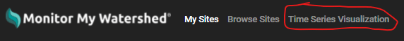
Monitor My Watershed Menu > Time Series Visualization Tab
Clicking on Time Series Visualization in the Monitor My Watershed menu (Figure 14) will open a blank visualization screen for you to customize (see Section 6.2).
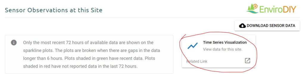
Browse Sites > Selected Site > Time Series Visualization Tab
(For viewing all variables for a specific site streaming to Monitor My Watershed)
Click on Browse Sites in the Monitor My Watershed menu to select a site (see Sections 5.1 and 5.2) and then view the last 72 hours of data for that site. Clicking on the Time Series Visualization link (Figure 15) on the Site Details page will take you to the TSV screen pre-populated with the site. Add a parameter to the plot using the Add Series list in the lower right hand corner.
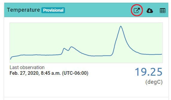
Browse Sites > Selected Site > Selected Variable > Time Series Visualization Tab
(For viewing a single variable for a specific site streaming to Monitor My Watershed)
Click on Browse Sites in the Monitor My Watershed menu to select a site (see Sections 5.1 and 5.2) and then view the last 72 hours of data for that site. The header above each graph contains three icons. Clicking on the first icon (Figure 16) will take you directly to the Time Series Analyst Visualization tab with an expanded graph for that specific variable.
6.2 Customizing Visualizations
Time Series Visualization (Figure 17) allows users to plot selected variables and adjust the time scale.
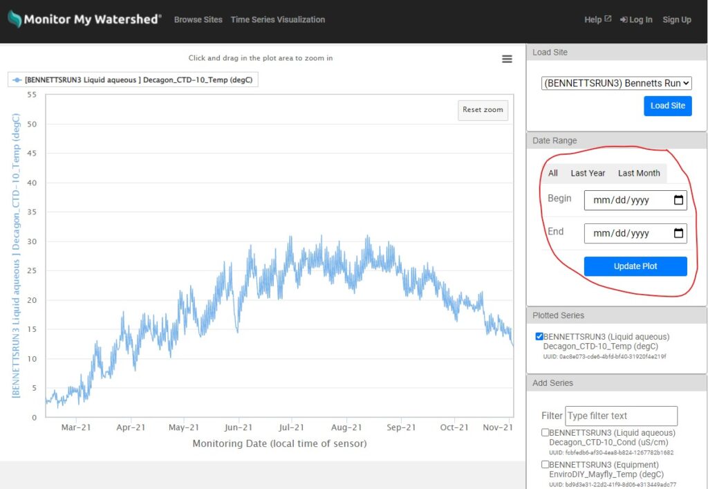
Choose a site for visualization from the drop-down list in the upper right hand corner (Figure 18). You can also start typing a site name in the “Filter” box to quickly select it. Once you’ve selected a site, click the “Load Site” button to populate a list of parameters to select from. Note: Once you’ve clicked the “Load Site” button, the button will have a light blue outline around it to indicate the selection has been made.
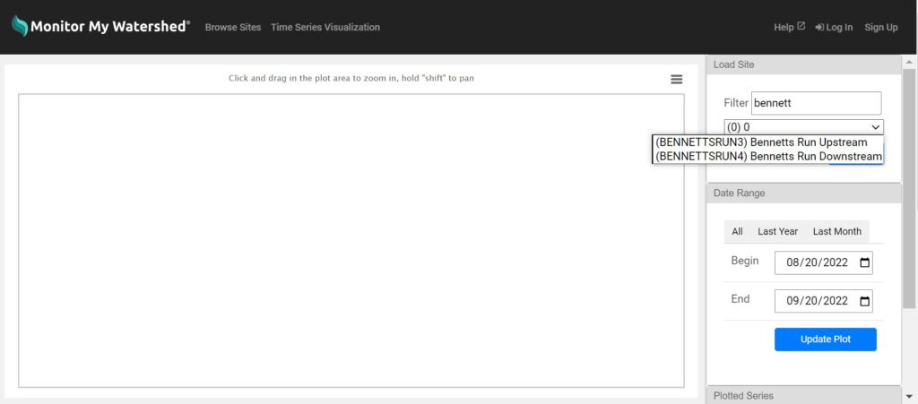
Scroll down to the “Add Series” section and select the check box for the parameter series to add (you can also use the “Filter” box to search); all records for that parameter will be added to the plot. Adjust the date range by clicking and dragging over the plot or by using the “Date Range” functions (Figure 19).
Additional parameters and sites can be added to the plot by repeating these steps.
