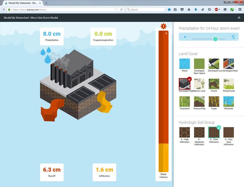
As the parameters are selected on the right part of the screen, the infographic on the left changes. It will always show a cube of land with the selected land cover on top and the soil type on the sides.
In the upper left corner of the infographic is a box with the amount of rainfall listed. The boxes at the other corners of the infographic show the amount of rainfall that will end up as evapotranspiration (ET, water that immediately evaporates or is taken up by plants), runoff (R, water that flows across the land surface), and infiltration (I, water that seeps through the soil).
Arrows coming out of the block in the infographic change size as the amount going into each component increases. The size of the arrows is proportional to the amount of rainfall; larger rainfall amounts will always lead to larger amounts of water coming out and thus bigger arrows.
To the right of the cube of land is a bar graph showing the distribution of water. This bar graph shows the percent of water going into each category (ET, I, or R). The size of the bar graph is the same for every storm size.
If more than 2 cm of rainfall will become runoff, an exclamation point will appear at the top of the bar graph. The colors of the bar graph match the colors of the arrows and the colors of the numbers in the text boxes.

